An open card sort study on Interactive Media program's website

OVERVIEW
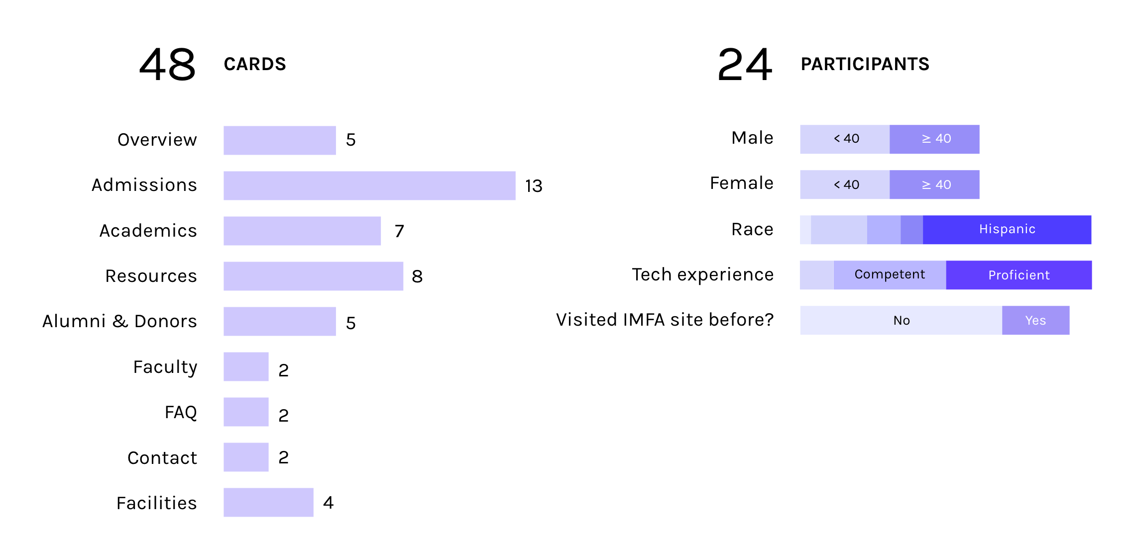
My team — Liz Estefan, Jessenia Morales and I conducted a Directive & Cautious Card Sort Study with 24 participants. They were instructed to sort 48 cards based on item similarity and to be thoughtful in the process. The purpose of the study was to better understand our users' mental models and feedback regarding the content, terminology, and organization of UM's Interactive Media program's website.
PRODUCT DESCRIPTION

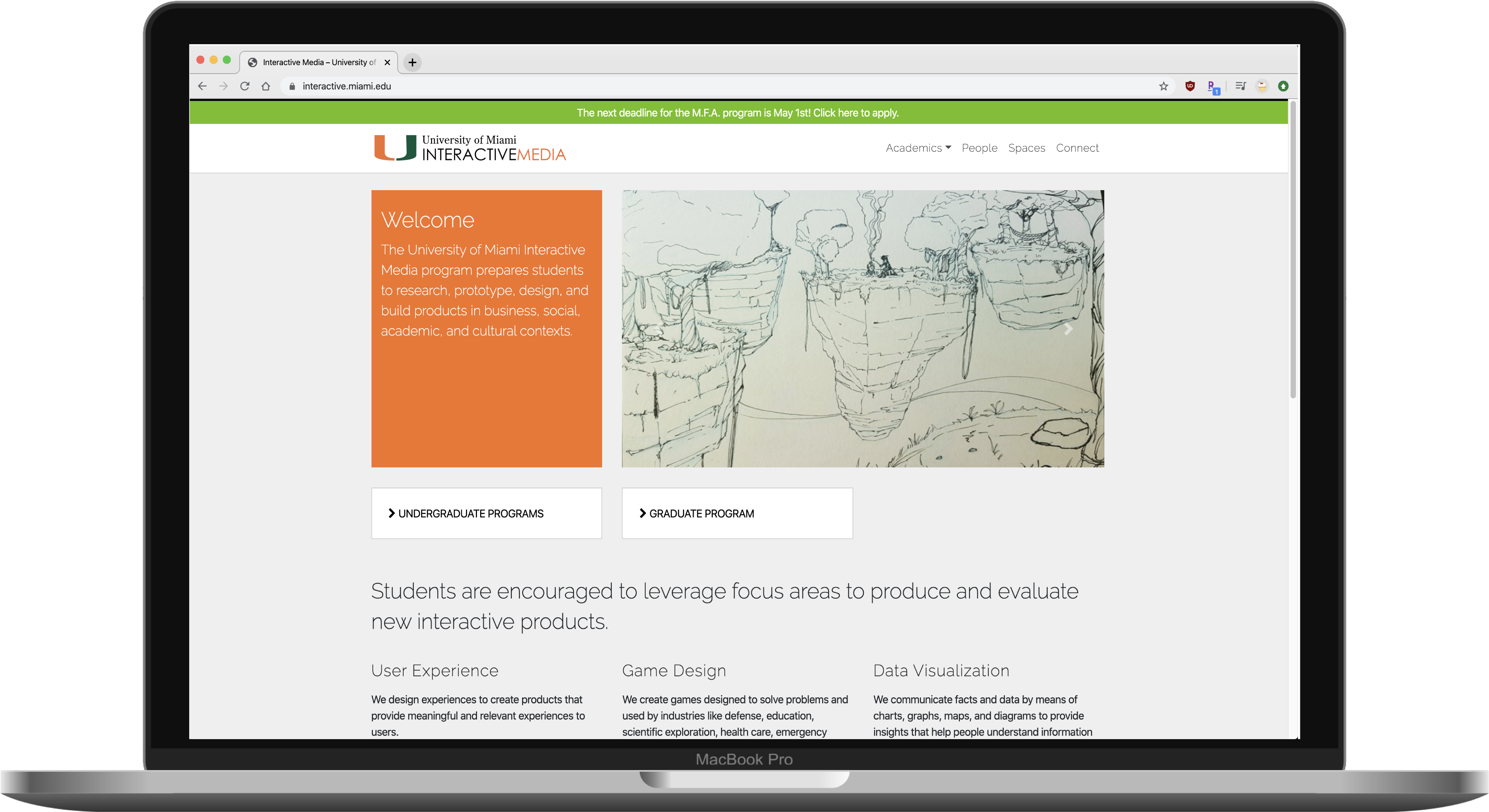
The Interactive Media's website serves as a tool to introduce the curriculum, resources and anything related to this program to its visitors. The target users are mainly prospective students, parents of prospective students, current students, alumni, program partners and donors. The product goal is to recruit new students, inform students about the program and provide collarbation opportunities for partnerships with companies and job / internship opportunities for students and alumni.
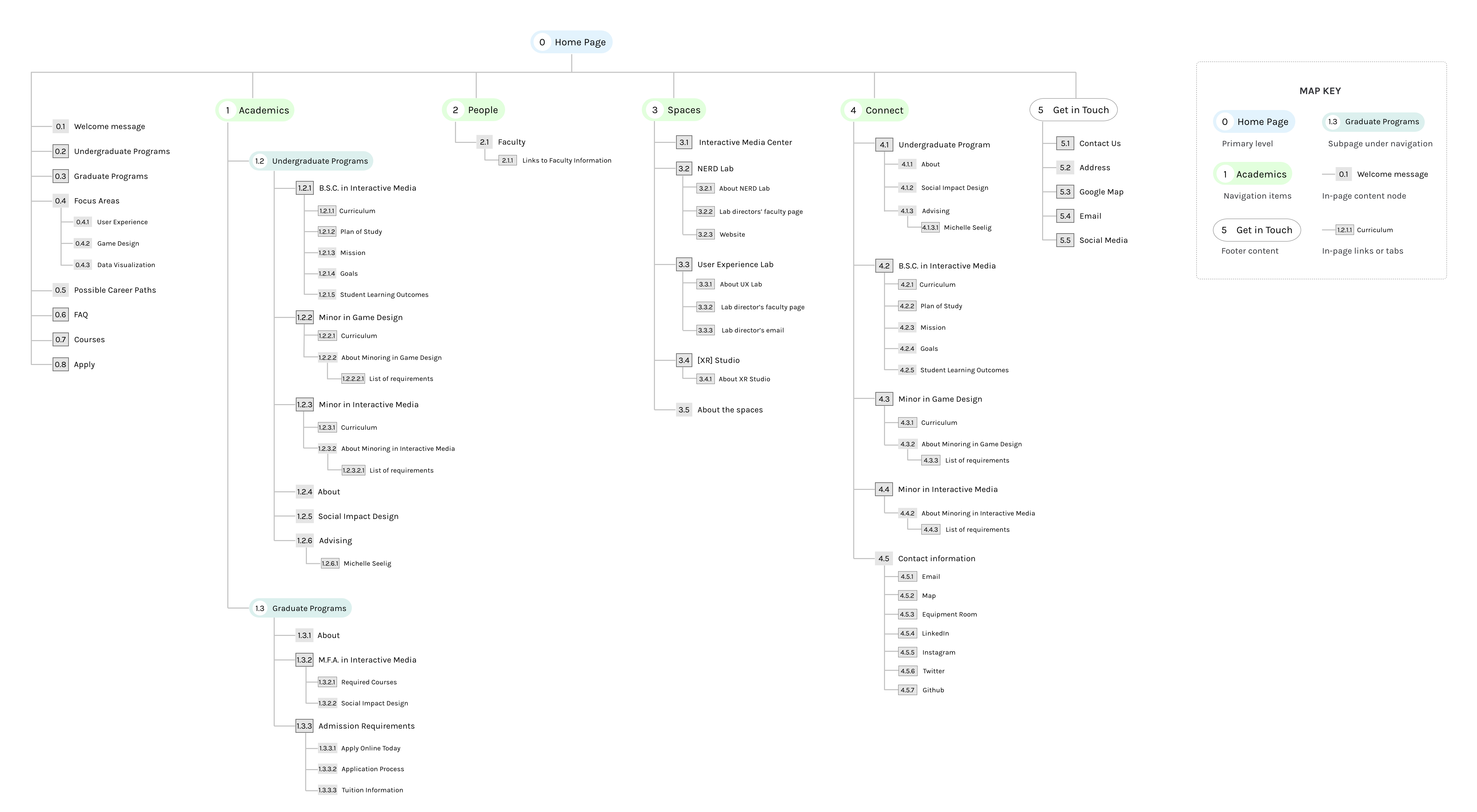
CURRENT IA

This sitemap helped us to identify some problems with the website's structure. We noticed that many contents or card items were missing before we even recruited any study participants. Among other things, there are no detailed admissions details at all, and if there is an external link, that link isn't functioning. On the connect page, there is no information on donors or partner companies, there is no way to view job / internship opportunities, and the information is redundant.
DATA COLLECTION

Optimal Sort was used to conduct an open card sort study in which we examined how our target users expect to see in the information architecture. After explaining the purpose of the experiment to participants, we asked them to fill out a series of profile questions. After they arranged the cards thoughtfully in meaningful groups, we asked them to label each group and prioritize them.
DATA ANALYSIS & FINDINGS
We evaluated the data using the distance matrix, the dendrogram, the standardized labels, as well as how the participants prioritized the categories. Analyses reveal the most frequently grouped / paired items and possible subcategories based on keywords and relevance.
- General information about the program should be prioritized and easily accessible, especially for prospective students.
- The information for each audience should be separated. Information for students, alumni and prospective students should each be in their own category in order to simplify the information search.
- Undergraduate information and Graduate information should not be in the same category.
- Participants group item lists together based on keywords. Therefore, consistent terminology should be used when describing related content.
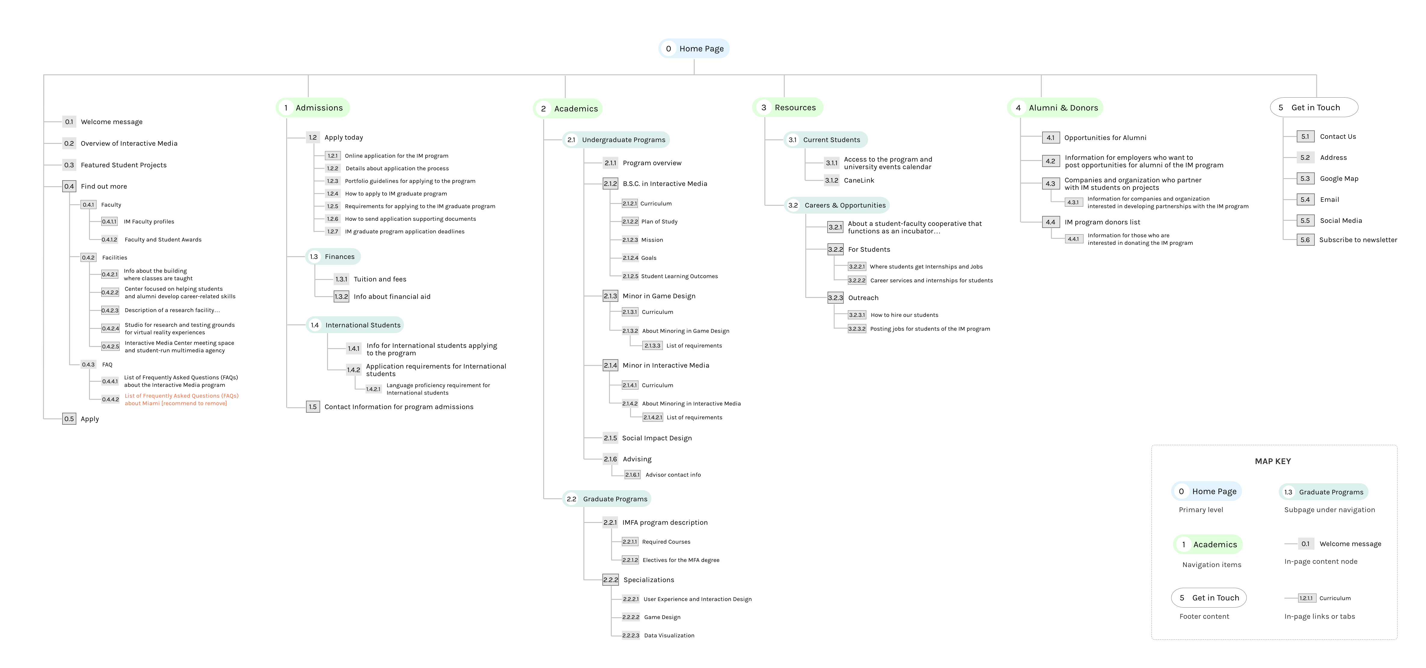
IA REDESIGN
